
AI Interior Design Color Palette: Build the Perfect Scheme from a Photo
An AI interior design color palette generator takes a photo of your room, pulls out its dominant colors with exact hex codes, and builds a balanced scheme you can take straight to the paint store. According to Wikipedia’s overview of the color scheme concept, a coherent palette has always relied on choosing colors that work together by design rather than accident — AI just automates that choice from a single upload.
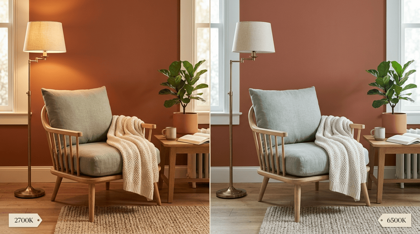
In seconds, most tools return a working AI color palette of 5-7 colors, split by role using the classic 60-30-10 rule, then map every swatch to a real paint-brand code. The same palette can also be previewed under different light, from a warm 2700K bulb to a cool 6500K daylight lamp, so the colors you pick actually look right once the room is painted.
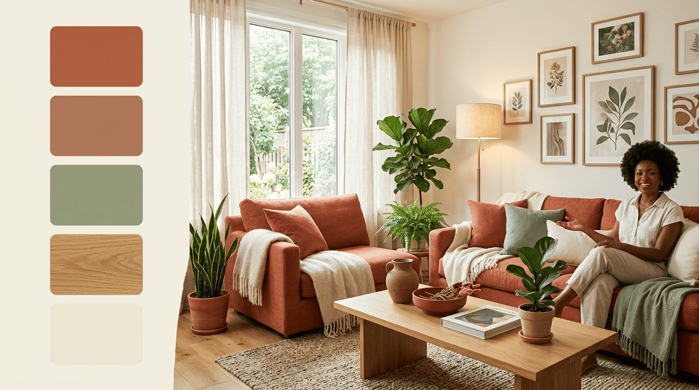
What Is an AI Interior Design Color Palette Generator?
An AI color palette generator is a tool that reads a photo of a room and turns it into a structured set of colors you can design around. Upload a picture of your living room, bedroom, kitchen or bathroom, and the software samples the image, finds the dominant colors, groups similar tones together, and returns a palette with precise hex codes and suggested accents — all within seconds.
Beyond just listing colors, a good interior color palette generator interprets what the palette says about the room. It flags the overall mood — warm, cool, calm, dramatic or earthy — and points out where existing elements clash, like a cool-gray floor fighting a warm-toned rug. From there it suggests accent pieces such as throw pillows, wall art, lighting, or a single feature wall to pull the room together.
What an AI room color visualizer typically tells you:
- The dominant hex codes sampled directly from your walls, floor and large furniture
- The room’s overall temperature and mood (warm, cool, calm, dramatic, earthy)
- Color conflicts between fixed elements like flooring, cabinets and countertops
- Suggested accent colors for pillows, art, and a potential feature wall
From your photo to a ready palette
The AI analyzes your photo pixel by pixel, isolates the dominant colors, and groups near-identical tones so you aren’t left with fifteen barely-different shades of beige. The output is a clean palette with exact hex codes, ready to use whether the space is a full living room, a narrow galley kitchen, or a small guest bathroom.
What it tells you
Because the AI color palette tool reads the whole photo rather than one swatch at a time, it also catches relationships a human eye can miss on a screen — like a warm oak floor pulling against a blue-gray accent wall. Flagging that conflict early saves a repaint down the line.
How an AI Color Palette Generator Works
Most tools follow the same three-step logic under the hood, whether you’re using a free browser tool or a paid app tied to a home design platform. The process starts with detection, moves to selection, and ends with a realistic visual preview.
In visual perception a color is almost never seen as it really is—as it physically is.
Josef Albers, color theorist and author of «Interaction of Color»
That’s exactly the problem an AI palette tool is built to solve: it measures color the way a sensor does, not the way a tired eye does at 9 p.m. under a yellow bulb. Surface segmentation is the technical piece that makes this possible — the software separates a photo into distinct zones (walls, ceiling, floor, cabinetry, upholstery) so each surface gets its own accurate color reading instead of one blended average for the whole room.
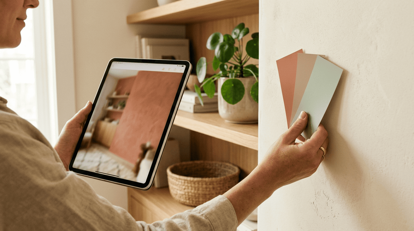
The three-step flow
Here’s how it breaks down in practice: first the AI detects the existing colors and separates the photo into surfaces — walls, ceiling, floors, and furniture. Next, you pick or match a color, either choosing a shade from the generated palette, using an eyedropper on any pixel in the photo, or typing in a HEX or RGB value directly. Finally, one click repaints the selected surface instantly, rendering realistic light, shadow, and texture so the preview looks like an actual photo rather than a flat color block.
From hex code to a can of paint
Every color the generator produces is mapped to real paint-brand codes from major manufacturers, so the exercise doesn’t stop at a pretty digital swatch. You walk into a paint counter, hand over the code, and get the exact tint mixed — no guessing based on how a color looked on a phone screen under office lighting.
The Color Rules an AI Palette Follows
An AI color palette generator isn’t picking colors at random — it applies design conventions that professional decorators have used for decades, just automated. Two rules do most of the work: the 60-30-10 split and classic color harmony.
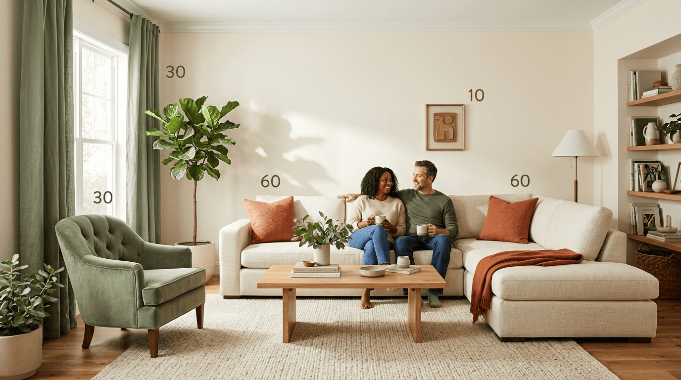
The 60-30-10 rule
The 60-30-10 rule assigns every color in a room a role based on how much surface area it covers. Sixty percent of the room is a dominant color, usually the walls and largest furniture pieces. Thirty percent is a secondary color, typically curtains, an area rug, or upholstered chairs. The final ten percent is a pure accent — pillows, artwork, and small decorative objects. The structure keeps a room from looking monotonous while still feeling unified, whether the style leans Scandinavian-minimal or maximalist boho.
| Role | Share of the room | Typical surfaces |
|---|---|---|
| Dominant | 60% | Walls, ceiling, large furniture |
| Secondary | 30% | Curtains, rugs, upholstered chairs |
| Accent | 10% | Pillows, art, small decor |
Harmony types and palette size
Once the 60-30-10 shares are set, the AI still needs to choose which specific hues go into each slot — that’s where color harmony comes in. Wikipedia’s entry on complementary colors explains that pairs sitting opposite each other on the color wheel create strong visual contrast, which is one of four harmony types an AI color palette tool typically works from:
- Complementary — opposite pairs on the color wheel (blue and orange), used for bold contrast
- Analogous — neighboring hues, producing a calm, cohesive look
- Triadic — three evenly spaced colors for a vibrant but balanced scheme
- Monochromatic — tints and shades of a single hue for a quiet, unified room
Most generators settle on a final AI color palette of 5-7 colors: one dominant neutral, one secondary color, one accent, and two to four supporting shades reserved for trim and the ceiling.
Color Palettes by Room Type
Every room has a different job, and the palette an AI tool suggests usually reflects that. A home office and a primary bedroom rarely land on the same scheme, even in the same house.
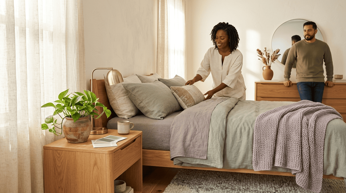
Living rooms tend toward warm neutrals like greige, warm white and camel, or a cooler neutral base paired with one saturated accent color for energy. Bedrooms lean on muted, cooler tones — soft blue, sage, warm gray, or lavender — chosen specifically because they support sleep rather than stimulate the eye. Kitchens are built around fixed elements that can’t be repainted, like countertops and cabinet hardware; a common pairing is a sage-green lower cabinet run with a crisp white upper. Bathrooms range from spa-style neutrals to bold jewel tones, since the smaller footprint makes a saturated color easier to live with.
| Room | Common AI-suggested palette | Why |
|---|---|---|
| Living room | Warm neutrals + one bold accent | Energy without visual chaos |
| Bedroom | Soft blue, sage, warm gray, lavender | Muted tones support rest |
| Kitchen | Sage green lower + white upper | Works around fixed cabinetry/countertops |
| Bathroom | Spa neutrals or jewel tones | Small footprint absorbs bold color well |
How Lighting Changes Your Palette
The same hex code can look like two different colors depending on when and how you view it, which is why lighting is treated as its own factor rather than an afterthought. According to Wikipedia’s explanation of color temperature, light sources are measured on a Kelvin scale, and that measurement directly shifts how warm or cool a paint color reads on the wall.
Why the same color looks different
Four light types typically shape how a color performs in real life: natural daylight (which varies by which direction a room faces), warm incandescent bulbs, cool fluorescent tubes, and tunable LED bulbs that run anywhere from 2700K to 6500K. A well-built AI color palette tool renders the same wall under each of these conditions so you can see how a color shifts across a full day, not just at the moment you took the photo.
| Light source | Approximate Kelvin | Effect on color |
|---|---|---|
| Warm incandescent | ~2700K | Intensifies warm tones, yellows/oranges |
| Tunable LED (warm setting) | 2700K-3000K | Similar warm cast, adjustable |
| Cool fluorescent | ~4000K-5000K | Flattens color, can read cool/gray |
| Tunable LED (daylight setting) | 5000K-6500K | Crisp, neutral to cool cast |
North vs south facing
The direction a room faces changes which colors read well in it. North-facing rooms get consistently cooler, flatter daylight, so warm tones — soft yellows, warm grays — help compensate and keep the space from feeling cold. South-facing rooms receive strong, warm direct light for much of the day, so cooler blues and greens balance that warmth instead of pushing the room toward overly golden or hot-looking walls.
Is There a Free AI Color Palette Generator?
Yes — most AI interior design platforms offer a genuinely free tier or trial to build your first palette, with paid plans adding extra features on top rather than gating the core tool behind a paywall.
Free to try
Most AI color palette tools are free to start, often with no credit card required, and run directly in a browser without an install. Paid tiers usually unlock more renders, higher-resolution exports, or access to a broader library of paint-brand matches, but the core photo-to-palette workflow is typically available at no cost.
What a paid tier typically adds on top of the free palette:
- More renders and repaint previews per month
- Higher-resolution exports for printing or sharing with a contractor
- A wider library of matched paint-brand codes
- Saved project history across multiple rooms
How to start
Getting a usable palette takes only a few minutes with the right AI interior design assistant:
- Take a photo of the room in daylight, ideally with the main light source turned on.
- Upload the photo to the generator.
- Review the extracted palette and hex codes.
- Experiment with accent colors and preview the room under warm and cool light.
- Export the final paint-brand codes to take to the store.
FAQ
Exploring more of your home? See our guides on living room design and bedroom design.